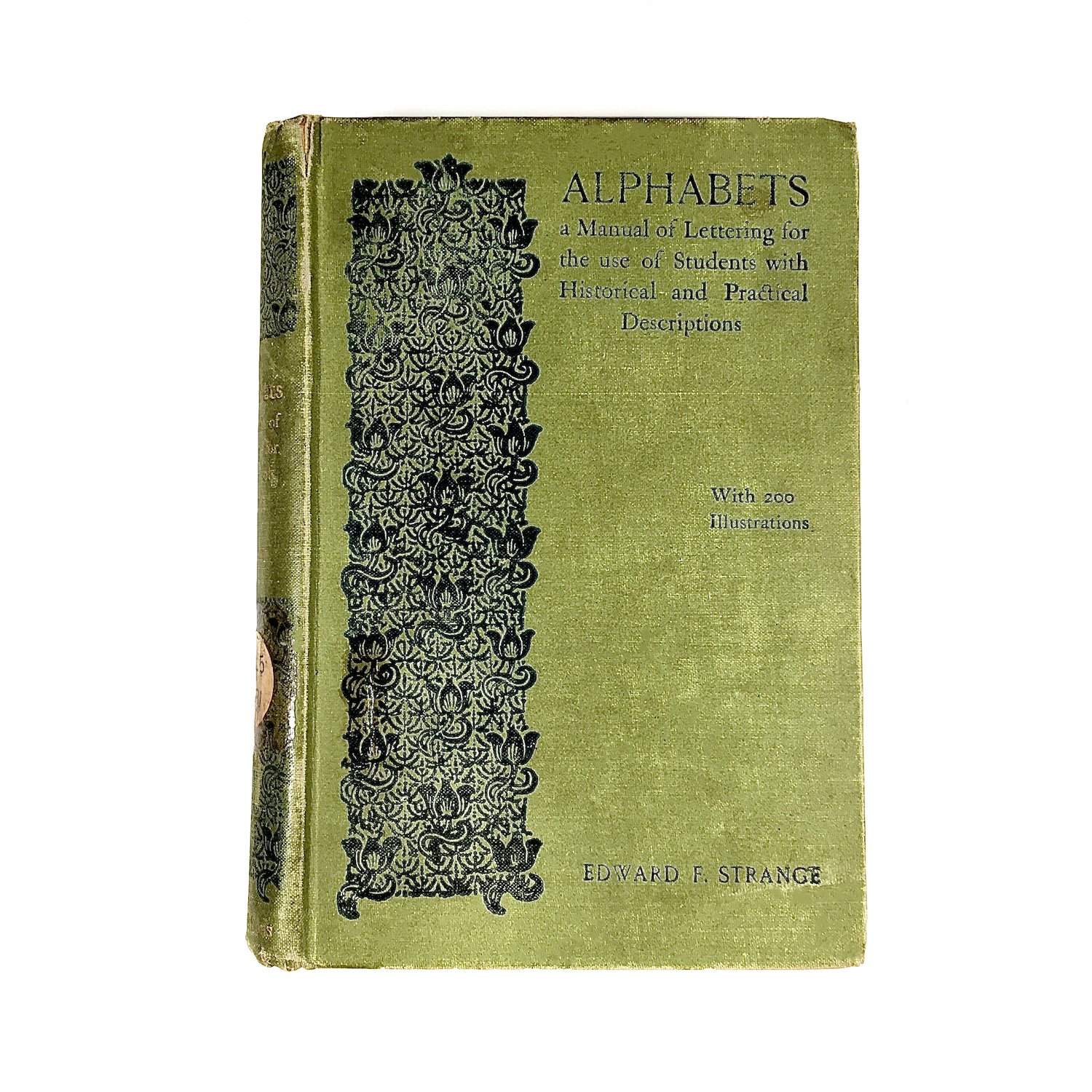
No. 10 Alphabets, by Edward F. Strange
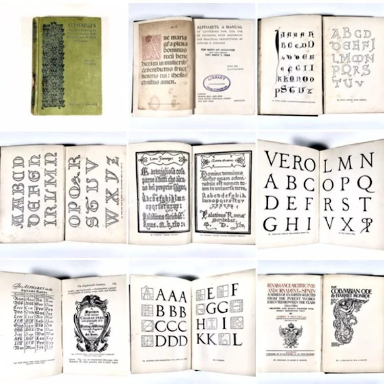
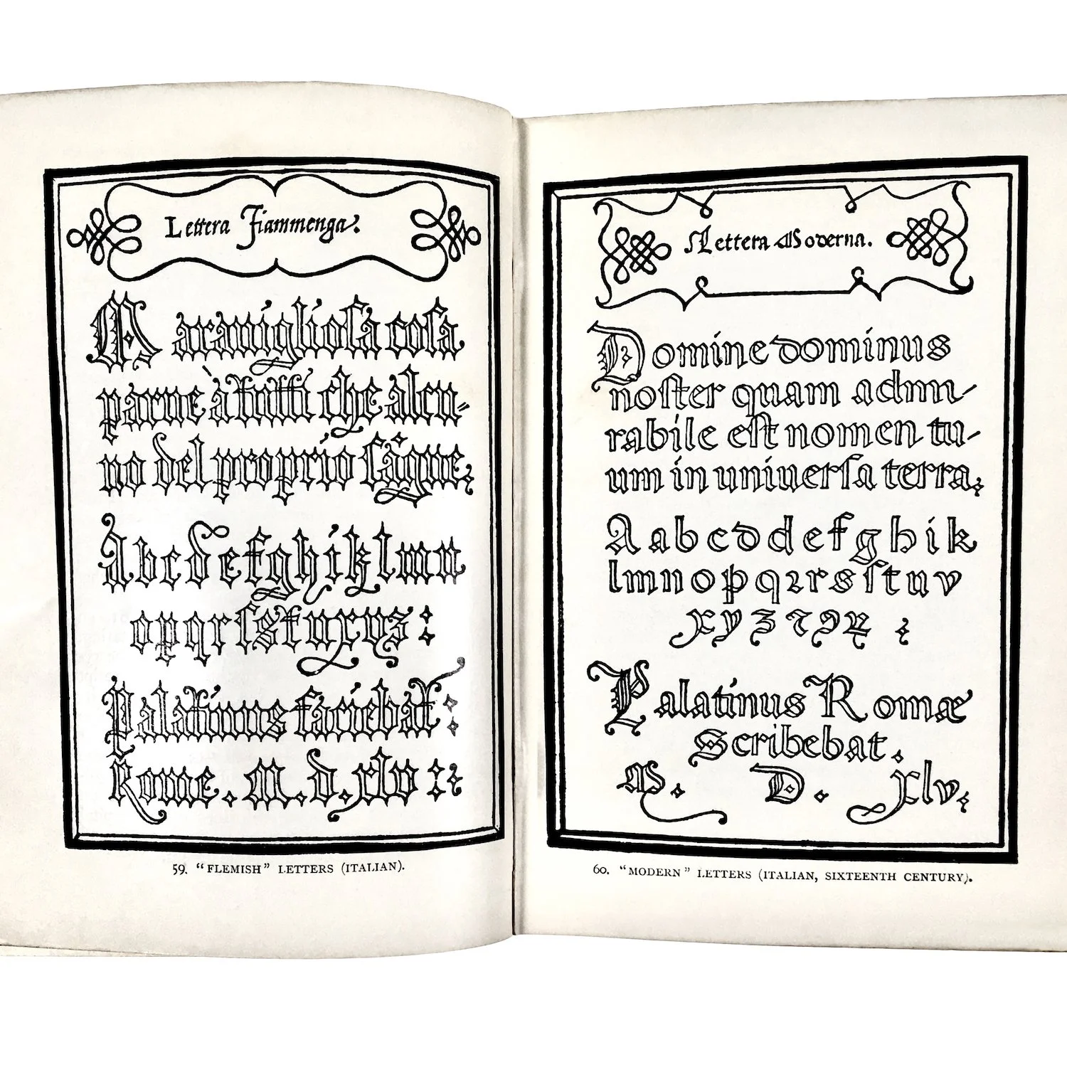
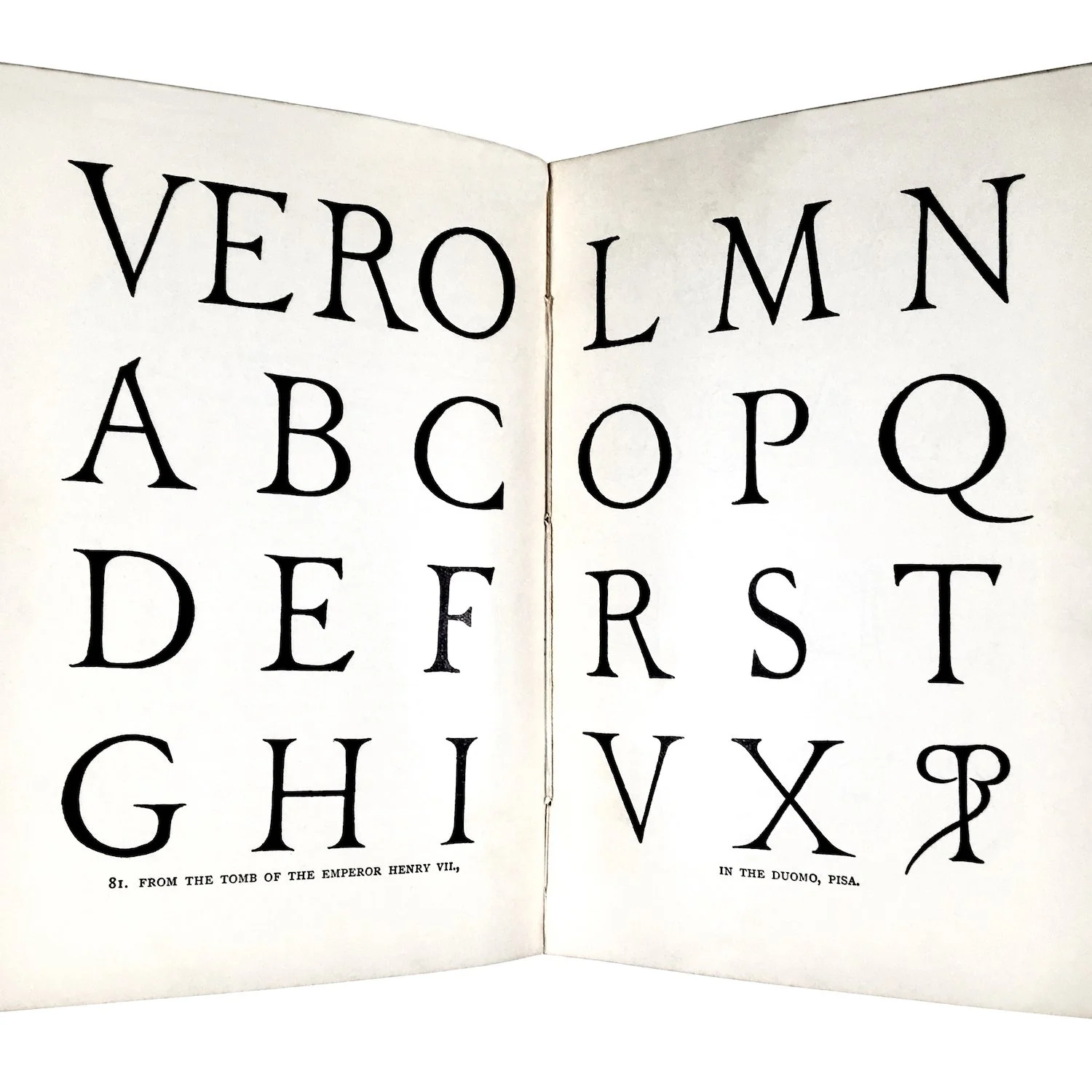
This was published first in 1895, and ran to four editions. It’s a tour de force for its profuse illustrations – reproductions of alphabetic samples from the sixth century to the end of the nineteenth. It is letterpress printed and I like the way the type kisses the smooth paper but still leaves an impression. There’s nothing startling about his narrative of the evolution of the alphabet, but it’s thorough and wonderfully in sync with the illustrations. One disappointment for those obsessed with print history is that in treating the period of incunabula he skims over the 15th century innovations of Nicolas Jenson and Aldus Manutius in developing the Roman and Italic that became the mainstays of typography. But on the other hand, his fascination with more obscure and earthy examples of alphabetic invention is really interesting, and worth taking note of. Lettering from labels, inscriptions, ceramics, bas-relief, and headstones are shown. There is even a 'cottage board' of a kind prevalent in the 18th century, a crude example from one Warrington Hogg in 1718. Warrington shares pages with Albrecht Durer — and that is very pleasing.


